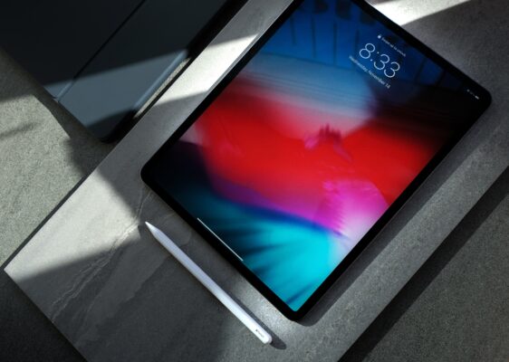
Being an iPad user and operating Instagram has always been a frustrating experience. Once you’ve bought the iPad you expect it to be compatible with all the applications present in the iPhone with an even better experience. While that is indeed true for most applications out there, the same cannot be said for Instagram. Being an iPad user myself, it gets frustrating to operate Instagram on a small vertical screen without proper integration of the iPad’s widescreen. Well, it looks like the pains of iPad users are not going to be fixed by Instagram, but there’s a silver lining to this cloud!
iPad Instagram web interface gets better
Our friendly neighborhood tech enthusiasts at The Verge were one of the first people to notice the changes in the web interface of Instagram on the iPad. While there is no specific app design for Instagram on the iPad, a slightly redesigned version of Instagram on the web can be seen. This new design includes a navigation sidebar with links to options like search, explore, notifications, and messages. These options were previously placed unlabelled at the top of the screen.
The Verge received a statement from Meta spokesperson Christine Pai where it was revealed that the company is working on improving the instagram.com web experience for users. The recent changes have been described as updates to ‘modernize’ Instagram web with the inclusion of improved navigation, optimization of video experience, and the introduction of a more ‘immersive’ way to DM.

This surely does not fill the shoes of having a dedicated application designed for the tablet experience but it’s a step in the right direction nonetheless. It was only back in February when Adam Mosseri, the Head of Instagram had written that creating an iPad-specific Instagram app was not on their priority list. It looks like nothing has changed since then!

