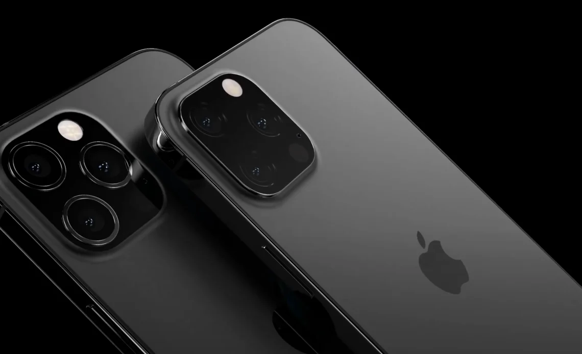
When we take a look at the electronics that surround us today, one thing stands out with almost mind-numbing consistency – the colours. Be it smartphones, laptops, or even the humble coffee machine, they all seem to follow an unwritten rule of having a white, silver, or black colour, but why is this the case?
The Heat Management Hypothesis
One of the more popular theories is that black is preferred due to its ability to manage heat. We all know from basic school science that black absorbs heat rather than reflecting it. The logic follows that by acting as a heat sponge, black surfaces can help dissipate the heat generated by the internal components of a device. In such conditions, heat management becomes paramount. Black, in theory, could help balance the heat flow inside and outside the device.
However, as appealing as this argument may be, there’s a noticeable flaw. If heat management were truly the driving factor behind this design choice, wouldn’t we see gadgets in all other colours regularly failing due to overheating? Yet, we don’t. Devices in white, silver, or even the occasional bold colour seem to function just fine without getting unduly warm. So, while this explanation has a certain charm, it might not hold water or, in this case, heat.
The Light Management Theory
Another suggestion comes from an old-school electronics enthusiast who traced the issue back to the 1970s. According to this theory, many semiconductor junctions are photosensitive, meaning too much exposure to light can cause chip malfunctions. In such a scenario, black could act as a shield, keeping the internal workings of the device safely in the dark.
If this were true, then black would naturally be a favoured colour for electronics, with white or silver coming in as secondary options due to their light-reflecting properties. The logic is sound, but once again, we run into the problem of other colours. Devices sporting shades of blue, red, or gold continue working as efficiently as their monochrome counterparts.

Cutting Costs – The Model T Argument
Let’s return to the Model T analogy for a moment. One plausible reason for the dominance of black, white, and silver could simply be cost control. Manufacturers might be sticking to a limited palette to streamline production and reduce expenses. This argument certainly holds water, especially for large-scale operations where uniformity can drive down costs.
Theoretically, the cost of adding the pigment should remain relatively constant whether you’re producing devices in black, silver, or a bold shade of neon pink. So why don’t manufacturers indulge in more vibrant colours if the price difference is negligible? Perhaps it’s because the gamble on brighter, trendier hues may not always pay off.
The Appeal to the Masses – Sales Maximization
Speaking of payoffs, this next theory suggests that the colour conservatism of our electronics is about maximising sales. Colour, after all, is a profoundly personal preference. What you might love in a shade of coral, someone else might loathe. Black, white, and silver, however, are universally neutral. They are the least likely to offend and, therefore, appeal to the broadest demographic. In a sense, these colours are the “safe bets” of the electronics world.
This theory becomes even more credible when considering the trend-based colour lifecycle. Remember that neon green gadget you once thought was the epitome of cool? It probably looks outdated now. In contrast, black, white, and silver have stood the test of time, offering a sort of visual longevity that allows electronics to avoid becoming design relics too quickly. Simply put, timeless colours sell, and what sells will always influence production choices.
The Cultural Influence of Japan
Another layer to this report is Japan’s profound influence on the global electronics industry. Post-World War II, Japan played a pivotal role in the electronics boom in terms of technological advancements and in shaping product design. Traditional Japanese aesthetics, which often emphasise simplicity and minimalism, are closely associated with black, white, and grey.
In many ways, the understated elegance of black, white, and silver resonates with the values of precision and craftsmanship that Japanese electronics have long been known for. The preference for these colours has now become a global design standard, creating a visual language that speaks to both functionality and sophistication.


The writing has the warmth and familiarity of a favorite sweater, providing comfort and insight in equal measure.
Consistently high-high quality content, as if you’re trying to show us all up.
A gift for explaining things, making the rest of us look bad.
Hey, Jack here. I’m hooked on your website’s content – it’s informative, engaging, and always up-to-date. Thanks for setting the bar high!
uwCxasjyhLpDkvRA
obiITOMzePRarCBW